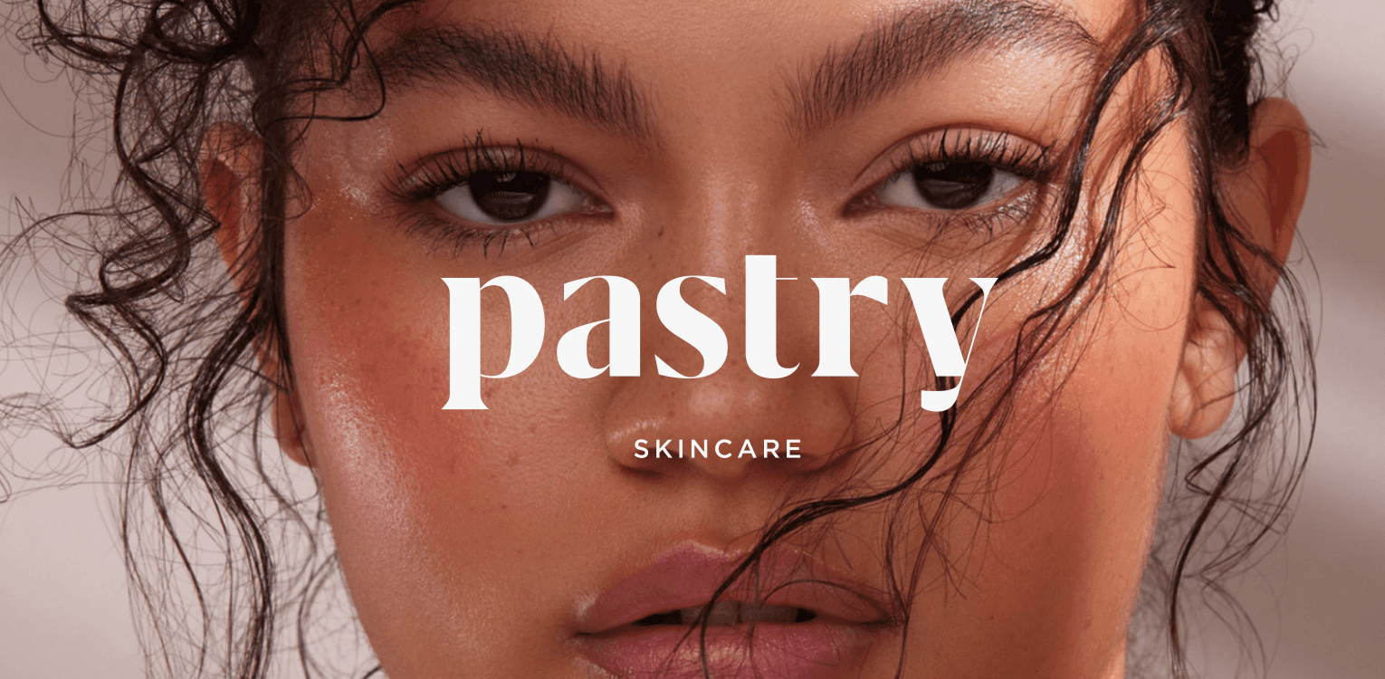

Pastry Skincare.
The Process
Locally manufactured, consumer focused.Pastry Skincare is Beauty on TApp’s skincare brand. The brand was founded as a response to the communities questions, comments, and requests for a skincare brand that addresses a wide variety of skin issues ranging from dry skin, uneven skin tone, texture issues, etc.
The community raised questions on why certain face serum active ingredients can’t be used in body care and Pastry decided to whisk something up to respond to this need.
Research
Moodboard
Strategy
Research
Moodboard
Strategy
Wireframes
Design
Wireframes
Design


Timeline
4 Weeks
Timeline
4 Weeks
My Role
Design ,UX/ UI
My Role
Design ,UX/ UI


Pastrys’ new look and feel is inspired by nature.The intent
of the brand refresh is so they can resonate with their
clients better, whilst improving the user experience for
prospective clients.
Pastrys’ new look and feel is inspired by nature.
The intent of the brand refresh is so they can resonate with their clients better, whilst improving the user experience for prospective clients.
The User flow


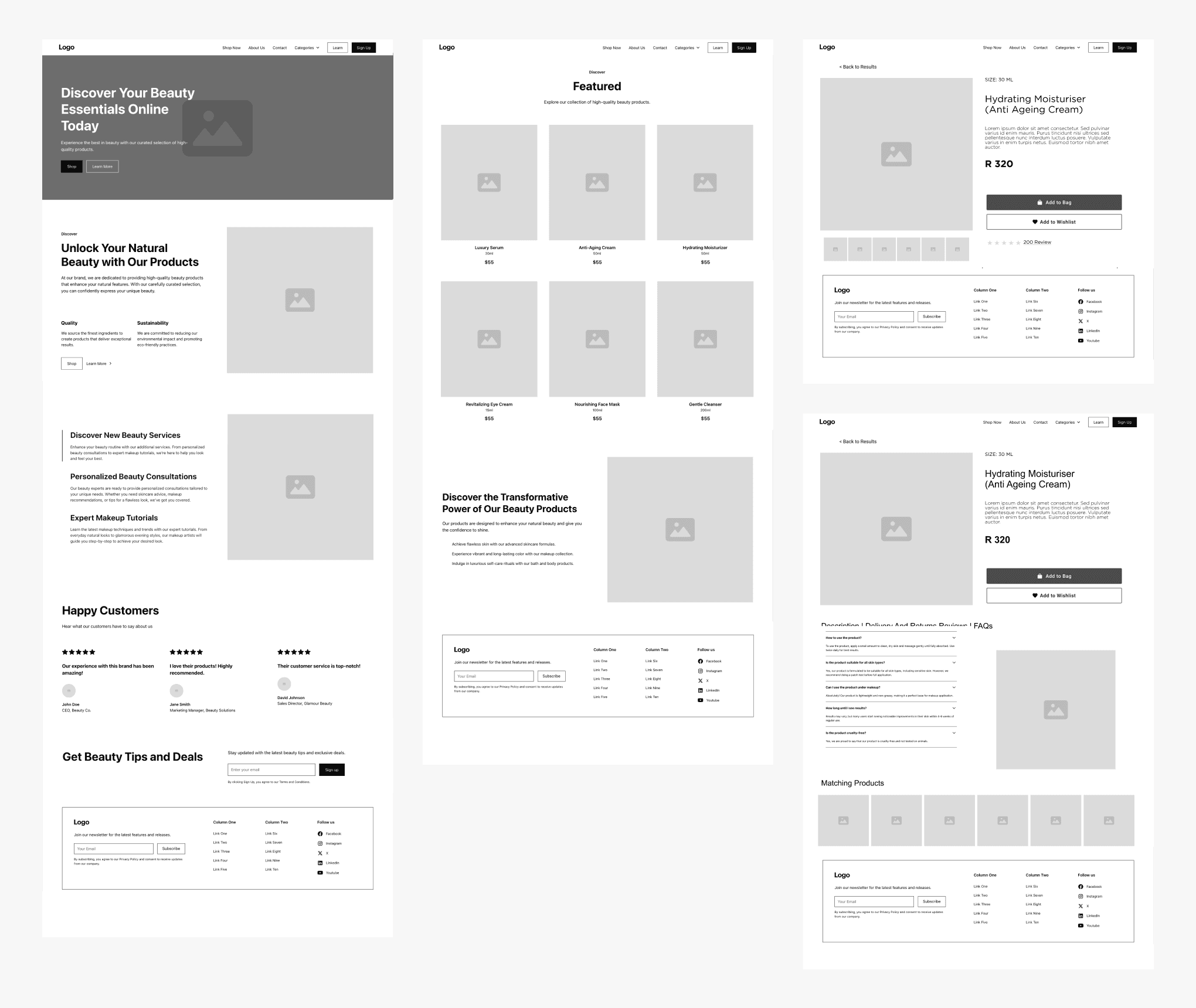
The Wireframes
Starting with wireframes, I was able to establish a solid foundation for the website design and structure. The wireframes worked as a prototype that addressed key layout and functionality considerations before moving on to more detailed ( High fidelity) design work.
Starting with wireframes, I was able to establish a solid foundation for the website design and structure. The wireframes worked as a prototype that addressed key layout and functionality considerations before moving on to more detailed ( High fidelity) design work.


The Moodboard


The Wireframes
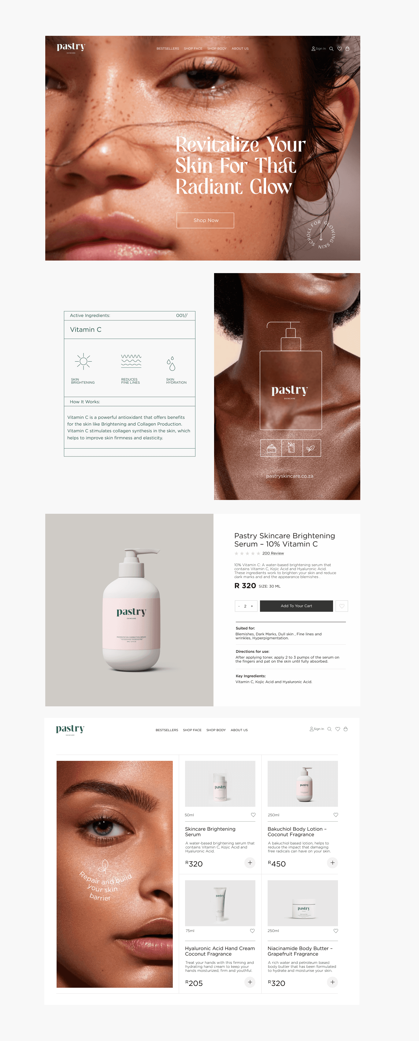
I developed a visual identity comprising of elevated colours, new typography, and image treatment styles.
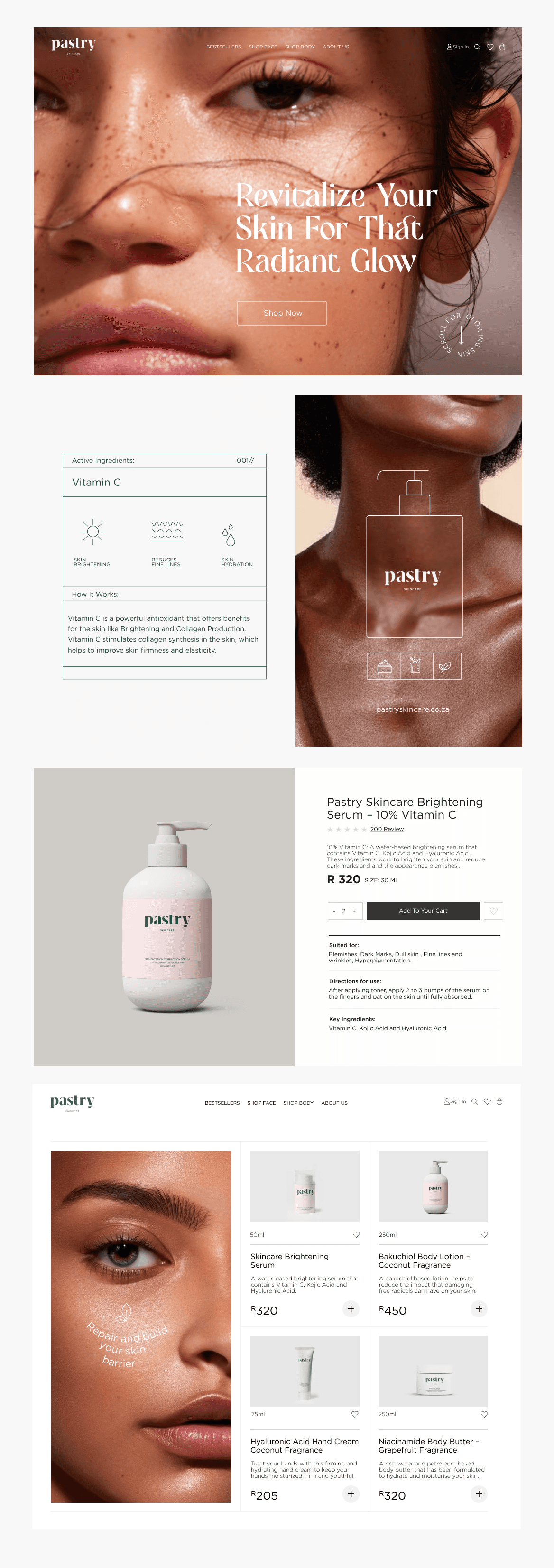
I developed a visual identity comprising of elevated colours, new typography, and image treatment styles.
High-quality, close-up images of diverse models with varying skin tones and types are used, emphasizing inclusivity and the suitability of products for everyone.
Products are photographed with a focus on textures and details.
They are often placed against neutral backgrounds to highlight their
form and packaging.
The overall composition is minimalistic, avoiding clutter and focusing on the essential elements, which aligns with the clean and modern brand aesthetic. The combination of elegant typography, neutral tones, and high-quality imagery creates a cohesive and refined visual identity.
The visual identity across the images suggests a sophisticated and modern aesthetic, tailored towards beauty and skincare products. The branding elements indicate a blend of elegance, minimalism, and inclusivity, aimed at appealing to a diverse audience.
Classic serif fonts are used, conveying elegance and timelessness.
They are predominantly seen in headers and prominent text elements. Paired with that are sans-serif fonts. These complement the serif fonts, used for body text and secondary information. This combination ensures readability and maintains a contemporary look.
Some text is artistically styled to follow the contours of images, adding
a dynamic and engaging visual element.
The visual identity across the images suggests a sophisticated and modern aesthetic, tailored towards beauty and skincare products. The branding elements indicate a blend of elegance, minimalism, and inclusivity, aimed at appealing to a diverse audience.
Classic serif fonts are used, conveying elegance and timelessness.
They are predominantly seen in headers and prominent text elements. Paired with that are sans-serif fonts. These complement the serif fonts, used for body text and secondary information. This combination ensures readability
and maintains a contemporary look.
Some text is artistically styled to follow the contours of images, adding
a dynamic and engaging visual element.


© 2024 MBALI MAGUBANE. ALL RIGHTS RESERVED.
CONTACT
ME
E: Sendtonmbali@gmail.com
Drop me an email or slide into
my LinkedIn DMs here

ME
ME
© 2024 MBALI MAGUBANE. ALL RIGHTS RESERVED.
CONTACT
ME
E: Sendtonmbali@gmail.com
Drop me an email or slide into
my LinkedIn DMs here

ME
ME
© 2024 MBALI MAGUBANE. ALL RIGHTS RESERVED.
CONTACT
ME
E: Sendtonmbali@gmail.com
Drop me an email or slide into
my LinkedIn DMs here

ME
ME
© 2024 MBALI MAGUBANE. ALL RIGHTS RESERVED.
CONTACT
ME
E: Sendtonmbali@gmail.com
Drop me an email or slide into
my LinkedIn DMs here

ME
ME
© 2024 MBALI MAGUBANE. ALL RIGHTS RESERVED.
CONTACT
ME
E: Sendtonmbali@gmail.com
Drop me an email or slide into
my LinkedIn DMs here
